Most UI moodboards are made once, admired in a kickoff meeting, and never opened again. The grid looks great. Then the actual design starts and nobody can say what the board was for. If you are working out how to make a moodboard for a product or a website, the steps are the same whether it is a design moodboard in Figma, a digital moodboard in Milanote, or a board you learned how to create a moodboard for a website from.
This is how to make a UI moodboard that does its job: getting a team to agree on a direction before pixels get expensive, and then staying useful while the work is being done.
How to make a moodboard that argues for a direction
A moodboard is an argument. It says: this is the direction, and here is the evidence. If you start collecting before you know what you are arguing for, you get a grid of things you like, which is a different and much less useful object.
Write one sentence first. "Calm, dense, professional: a tool people use eight hours a day." "Playful and fast, for teenagers, mostly on phones." That sentence decides what goes on the board and, more importantly, what stays off it.
Collect interface, not atmosphere
For a UI moodboard, photographs of fog and marble get you nothing. What you need is evidence of how the direction looks when it becomes an interface:
- Layouts. Real screens whose structure you want to borrow. Density, hierarchy, how much sits above the fold.
- Typography in use. Not font specimens. Type doing a job in a real product: a heading over a card, a data table, a settings label.
- Colour applied. A palette on a swatch tells you little. A palette on a working dashboard tells you whether it survives contact with real content.
- Components. Two or three components that capture the feel: a button, an input, an empty state.
- Motion. A short recording or a link. Motion is half of how an interface feels and is missing from most boards.
- Anti-references. Two or three things the direction is explicitly not. These often communicate more than the positive examples.
If you already keep a reference library, this step takes twenty minutes: search it for the direction and pull what fits. If you do not, this step is where you discover that everything good you have ever seen is in a screenshots folder you cannot search. That is fixable, and it is worth fixing before your next project rather than during it.
Label everything
A reference without a note is a Rorschach test. Everyone on the team sees something different in it, and the board quietly means five things.
Under every item, one line: what to look at and why it is here. "The way secondary actions are demoted to text links." "This much whitespace between sections." "Not this: the gradient dates it." Now the board says something specific, and someone can disagree with it, which is the point.
Structure the board so it can be read
Do not scatter. A moodboard people can read has a shape:
- The sentence at the top. The whole direction, in one line.
- Three to five hero references that carry most of the argument.
- Supporting groups: type, colour, components, motion, each clearly labelled.
- Anti-references in their own corner, clearly marked as such.
Twelve to twenty items total. If it is longer, you have two directions on one board, and it will be read as neither.
Moodboard tools: a moodboard app for the board, a library behind it
Use two tools, not one, because a board and a library are different things.
For the board: Figma or FigJam if the team already lives there, which most product teams do. Milanote if you want a freer canvas and easy client sharing. Either works. The board is temporary and opinionated, so the tool barely matters.
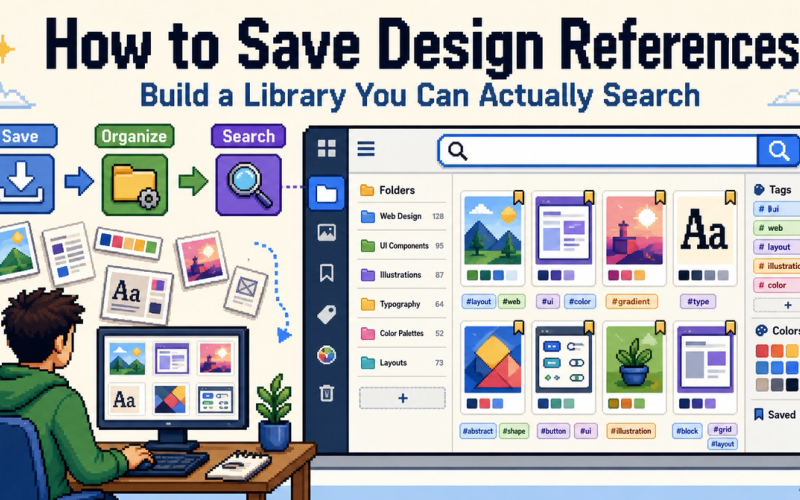
For the library the board draws from: something searchable and permanent. This is the tool most designers are missing. Pinterest is built for browsing, not retrieval, and does not work as a library. A screenshots folder is unsearchable by design. A reference manager with automatic tagging, such as GetRef, lets you save everything you see in one click and pull the relevant twenty into a new board in minutes. We compared the main options honestly in Eagle vs mymind vs GetRef.
The relationship is simple: the library is everything you have ever saved. The moodboard is the tiny, curated subset that argues for this project. Good boards are assembled fast from a good library. Slow boards are assembled from memory and open tabs.
Turn the board into decisions
The board has done its job when it produces decisions, not agreement. Before design starts, walk it with the team and write down what it implies:
- Type: this family, this scale, this weight for headings.
- Colour: this palette, this much of the accent, on these surfaces.
- Density: this many items per screen, this much padding.
- Motion: this fast, this kind of easing, on these transitions.
Put those decisions next to the board. Now when someone proposes something in week three, there is a thing to check it against that is more precise than "does it match the vibe".
Keep it alive
Open the board once a week while the work is being done. Add the screens you are designing next to the references they came from. Drop references that turned out not to fit. A moodboard that is updated during a project becomes the beginning of the design system documentation. One that is not becomes a file nobody remembers making.
For the system behind the library that makes all of this fast, see how to save design references.
Common questions
- How to make a moodboard for UI design, and what should it include?
- Real interface references rather than abstract imagery: layouts, typography in use, colour applied to actual components, motion examples, and a few anti-references showing what to avoid. Each item should have a one-line note on why it is there.
- What is the best tool for making a moodboard?
- For the board itself, Figma, FigJam or Milanote. For the library the board draws from, a searchable reference manager such as GetRef, so you can pull relevant saves into a new board in minutes instead of hunting for them.
- How many images should a moodboard have?
- Fewer than you think. Twelve to twenty well-chosen references with notes beat sixty unlabelled ones. A moodboard is an argument for a direction, and arguments get weaker as they get longer.
- What is the difference between a moodboard and a reference library?
- A moodboard is for one project and one direction; it is temporary and opinionated. A reference library is everything you have ever saved, permanent and searchable. Good moodboards are assembled quickly from a good library.